What’s new flyer
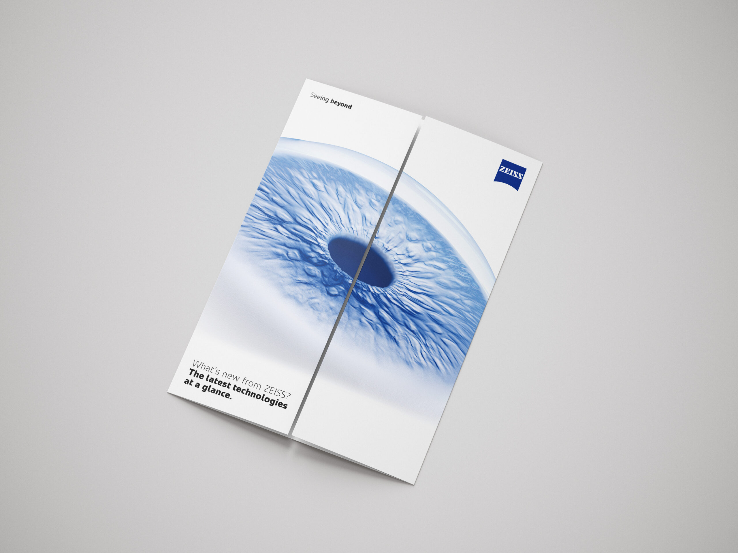


A gatefold flyer that shows event visitors what’s new in ZEISS ophthalmology at a glance, designed to a tight deadline, tracked from day one and printed in a run sized to avoid waste.
The need
The OPT team was heading into a busy run of events, with several new and updated products and services ready to talk about. Exhibition stands are hectic. Visitors move quickly, conversations get interrupted, and people often leave with a bag of paper and not much memory of any of it.
We needed one simple, easy-to-read piece that a customer could pick up, take away and understand in seconds: what is new from ZEISS, and where to go for more.
The piece also had a built-in shelf life. New products and services keep arriving, so a “what’s new” flyer goes out of date. That made the print quantity as important as the design.
My role
I designed the flyer and managed the print process. The marketing colleagues for each Ophthalmology sector chose which products appeared and wrote the copy, working from pre-approved messaging. I worked with them on layout and content, and with the printer on production and delivery.
Key decisions
Why a gatefold
This was a creative decision. I wanted the Ophthalmology key visual to carry the front, then have the flyer open to reveal what’s new. A closed gatefold looks clean and confident on a stand. Opening it gives the reader a small moment of discovery and a natural reason to read on.
Inside, each product or feature gets a short description, a short link and a QR code that goes straight to the relevant product or feature page. The detail lives online, and the flyer does the quick introduction.
Pre-approved messaging to protect the deadline
The time between the brief and the delivery of printed copies was short. Regulatory review of new copy could easily have taken longer than we had. So the marketing colleagues writing the text used pre-approved messaging for the products featured. We also gave the colleague responsible for final sign-off an early heads up, so their approval could be given before our print deadline and not land as a surprise on the day.
Because the flyer only mentions released products, we kept the content within what was already approved.
Short links with tracking built in
Every link in the flyer is shortened using Rebrandly. There were two reasons:
- Usability. If someone would rather type an address than scan a code, a short link is far easier than a long product page URL.
- Insight. The short links give us click data. On top of that, we added UTM parameters, which are small tags on a link that show our analytics tools where a visit came from. Together they show which products catch people’s interest, and not just that a flyer was handed out.
Sizing the print run
A time-sensitive document is expensive to over-print, because leftover copies become out of date as soon as the next product launches. In 2023 we produced a similar “what’s new” flyer at the start of our financial year, when we had a comparable number of new products and a similar number of events.
We used that as our baseline. I then worked with the marketing team on where and to whom they wanted to give the flyers, and in which roles. The bulk of the run goes to events, based on how many we used last time. A smaller share goes to account managers and CAS colleagues, who can hand one over when it will be useful in a conversation with a potential customer. Combining the historical numbers with the team’s plans gave us a calculated figure for the print run, with the aim of minimal waste.